Wednesday, November 18, 2015

Adobe Illustrator Progress


11-17-15


Getting Started (GS): What is Illustrator CS5?

This video is about how Illustrator is used, who uses it and how it is a vector based program.


11-18-15

GS-01: Using rulers and guides 

This video is about how to use rulers and guides and in what ways you would use them.


11-19-15

GS-02: Using the basic selection tools 

This video is about how to use the basic tools of Illustration. 


11-20-15


GS-03: Selecting artwork beneath other objects 

This video is about how to reselect a piece of art behind other objects. 

12-1-15

GS-04: Creating files for print 

This video is about how to prep a file for printing. 


12-2-15 

GS-05: The importance of modifier keys

This video is about how and why modifier keys are important to an artist in this program. 


GS-06: Using the Blob Brush and Eraser 

This video is about how to use the blob brush and eraser tools. 


12-3-15 

Using the new Art-boards panel 

This video is about how to use multiple art-boards in Illustrator CS5. 


References: 

Monday, November 9, 2015

Final Text Animation

For my final assignment during second quarter, we learned how to design a text animation in Adobe Flash. The project required us to come up with an academic word that portrays our school and animate it. The steps to create this animation was pretty similar to the walking stick man project and only introducing one new tool called the text box tool. This project consisted of different layers and key frames also including Tweens and the free transform tool. To start I had choose the word technology, because we use a lot of different technology here at EWEC, using the free transform tool I distorted and restored each letter individually. To conclude this project was surprisingly fun and simple, because I have been learning how to be proficient in Adobe Flash, but all in all I have learned very much this quarter. 


References: 

Tuesday, October 27, 2015

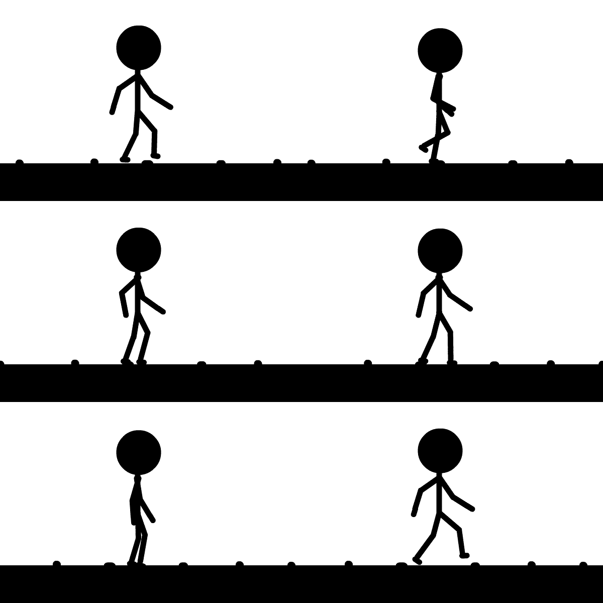
Flash Walk Cycle Animation


This quarter we started to work in a new application called Adobe Flash. With flash we were promoted to create a walking stick man flash cycle animation. This animation consists of 7 different layers: ground and rocks, torso and head, left leg, right leg, left arm, right arm, and footsteps. Each one of these layers (besides footsteps) are for each moving part to the animation. This project has took around 3 weeks to complete counting a week of development before I started the animation. There were around 28 steps to complete this assignment and today I would like to demonstrate the bone tool (step 10) and how it is used for animation.

The bone tool is the tool you use to create moving joints and ligaments. We used the bone tool to make the armatures witch are the moving arms and legs. In order to do this I created a line and broke it into symbols then using the symbols I attached joints to the line using the bone tool with constrained movement to allow the line to move in the posses of what a walking person would look like. Using this tool was no walk in the park I encountered many problems along the way including: overlapping symbols and bones, sections of the ligaments not behaving correctly to the constrains, and ghost arms floating away from the body. To correct these problems I had to restart and reposition most of the project however I was able to finalize the project. (Seen at bottom of page)

In conclusion, because this was my first animation, I had to solve many issues to get this walk cycle correct using the bone tool. I had a lot of fun on this project and was able to learn new animation skills. After learning how to demonstrate the skills to animate a simple walk cycle using key frames and motion Tweens and the bone tool on the timeline i will be able to create more advanced animations. 


References: 

Monday, October 5, 2015

WHAT IS MOTION DESIGN?

During our second semester in my contemporary media class, we will be learning about Motion Design and 2D animation. I have been asked to define motion design both literal and to my understanding. 

Motion Design is described by wikipedia as:
Motion Graphic Design is a subset of graphic design in that it uses graphic design principles in a filmmaking or video production context (or other temporally evolving visual medium) through the use of animation or filmic techniques.

Motion Design defined by me is: 
Any animation and design that is created to progress as a moving image that tells a story or relays an idea or concept.

There are several types of 2D animation a list of 2D motion design types are:

  • 2D animated short films 
  • cell phone apps 
  • advertisements/ promotional video
  • movie trailer 
  • game intro/ trailer 
  • 2D cartoon 
  • white board animation 
  • animated infographic 


Now that i better understand what 2D motion design is, i am ready to get started on designing my own creations and using motion design in my work. Knowing how to use this will better my standing in the working world as a graphic designer. 


Here are a few examples that i found on Vimeo:


Here are some examples of 2D motion design: 


REFERENCES: 

Tuesday, September 29, 2015

Photoshop Business Card Project

In my Photoshop class I had to design a business card promoting myself. In order to do this i had to create a design document on how i wanted it to look. In this document i had six things i needed to put into my card: 1)Two font types-Marker felt and Arial 2)Background color-White and yellow 3)Color scheme-red, green, gold, purple, and black 4)Contact Info- E-mail, Blog, Phone 5)An original image 6)Name and occupation. Before i started i had to download a photoshop template of the proper measurements of a business card. 

First i searched for a Photoshop font that represents me and one that is conservative. Second i had to decide on an background color, I chose white as the far background and yellow as the sun behind the peace sign because the white represents the tranquility in my life and the sun as the center. Third i had to choose a color scheme that was compliant, red is compliant with green and gold is compliant with purple as seen to the (top) right, i also used black but only for shadowing and strokes. Forth i had to add in my phone number, 760-898-9369, Email address, 1315077832t@gmail.com, and blog portfolio, TK313.blogspot.com, which i alined in the bottom left of my card. Fifth i had to design an original image for my card so i took a picture in PhotoBooth (a image capturing application) of my hand holding up an peace sign (middle right). I took this image and
redrew it and used it as background imaging. I also took a peace symbol (bottom right) and used it as the center of my card to draw attention to the middle of the card. Sixth i had to add my name and occupation, because my name is important i put it at the top of the card in a Marker felt font type. My occupation being the next thing i had to do i used the same font type positioned on each end of the card.

In conclusion this project has been fun because i was able to create
my own business card promoting myself. Due to this i will be able
to gain more business. I believe that knowing how to design a business card should open my opportunities as a graphic and blog designer. My business card is below and will be added into my portfolio as a reference to the work i can do. I believe that a business card is a great job experience because all graphic designers should know how to make and design a business card. 

References: 

Monday, September 14, 2015

Create a Colorful Grunge Portrait in Seconds

For our next Photoshop project, we learned how to create a grunge portrait of ourselves. I created this portrait by only using red, green and blue (RGB) colors. Using a grunge brush type along with multiple layers and mask tools, I chose a watercolor effect to make the grungey look of my image. I also changed the image levels of the picture I took of myself in Photo Booth. I then turned the picture into a black and white photo in order to invert the image and to be able to color myself. I enjoyed this project because I have never done anything like this before. Besides, it looks really cool!


Reference:
http://wegraphics.net/blog/tutorials/create-a-colorful-grunge-portrait-in-seconds/

Friday, September 4, 2015

Photoshop For Beginners: The Power of Layers

In my Contemporary Media class our objective is to be introduced to Photoshop. Here is my first project, it's a logo of my name. We learned how to use layers, text tools, and color palettes. After learning this we implemented them into a logo of our names. 


And here is my own modifications to the project.


References:
http://wegraphics.net/blog/tutorials/photoshop/photoshop-for-beginners-the-power-of-layers/